💼 MoneySuperMarket
🕰️ 2024
🧑🏻🎨 Product Designer
⚠️ The struggle is real:
Without a Design System, our product suffered from inconsistencies that caused developer inefficiencies and a jarring user experience.
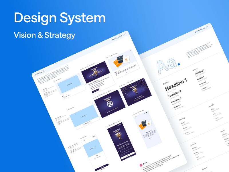
🎯 Vision:
Create a system that not only streamlines workflows but also ensures users enjoy a cohesive experience, building trust and satisfaction.
💡 My approach:
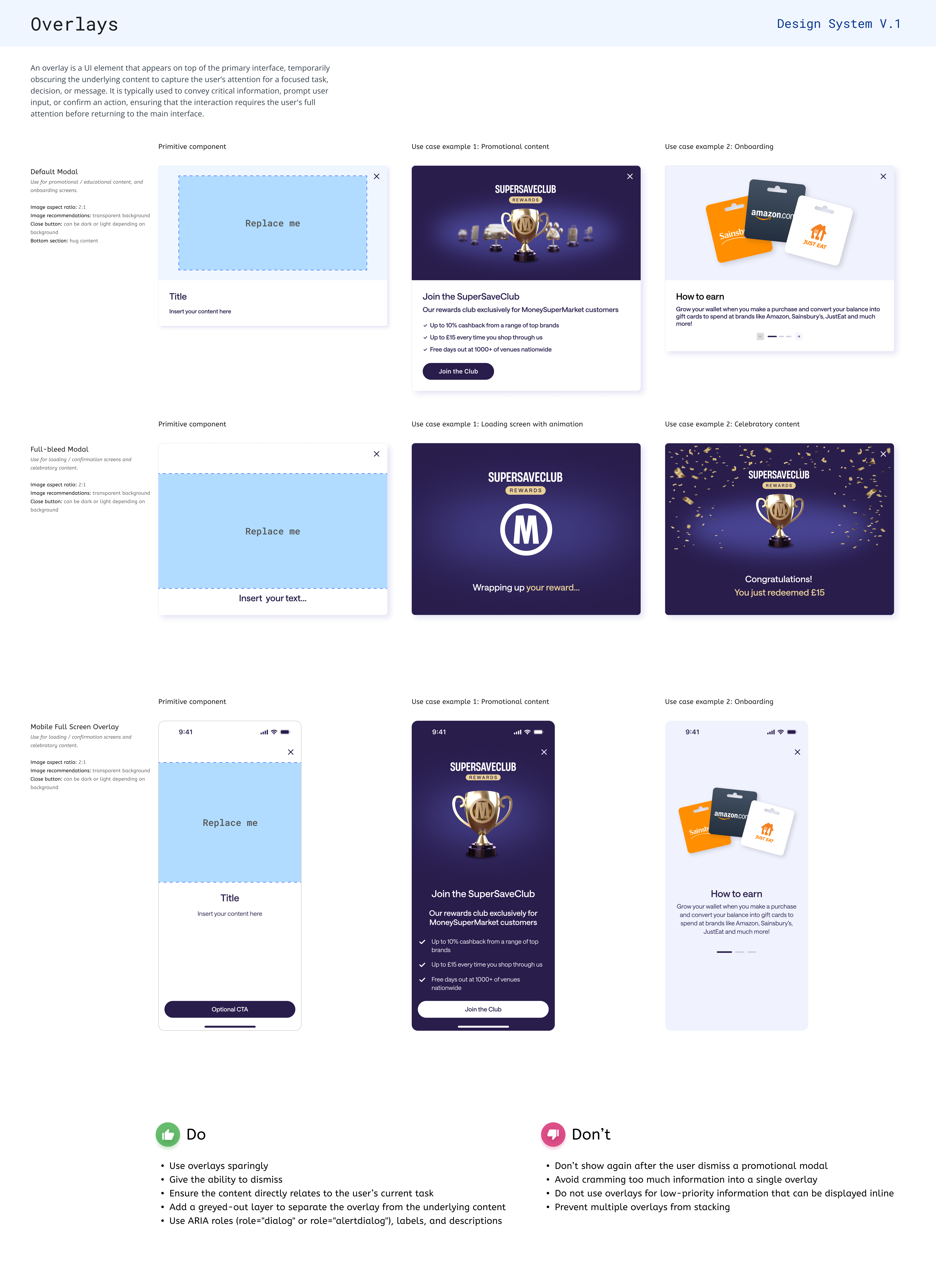
An audit revealed that modals were extensively used across user journeys but varied significantly in style. The first phase of my strategy was to standardise anatomy and rules for modal-based experiences.
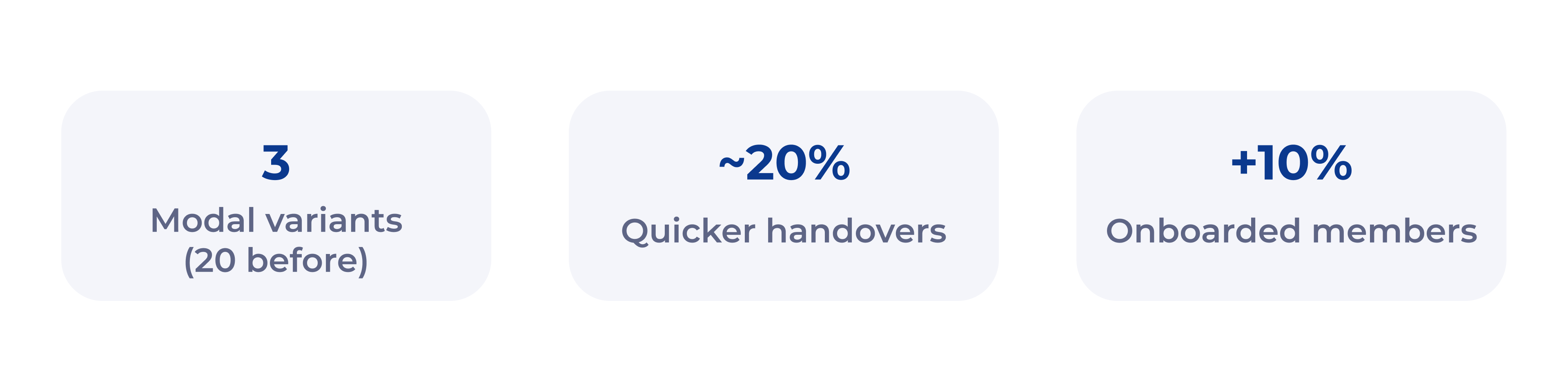
📈 Success metrics:
• Modals were reduced to 3 variants compared to the 20 different ones.
• 20% of time saved thanks to more standardised dev hand-offs.
📚 Topics covered:
Design Systems | Scalable Components | Design Sprints | User Testing | Accessibility.
To gain buy-in for a new system across the business, I needed to present compelling evidence of its benefits.
I leveraged design sprints, a structured, five-day process, to explore solutions quickly and validate ideas effectively.
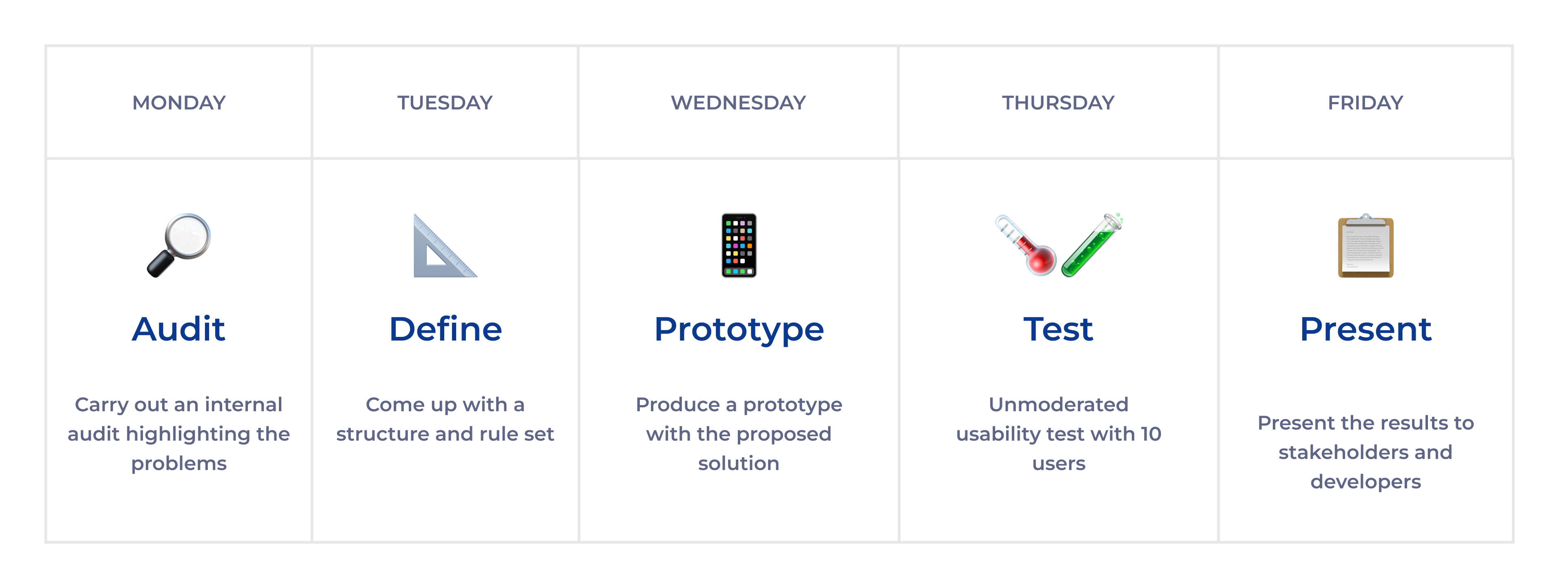
An audit revealed the extensive use of modals across core user journeys. Their inconsistent design and behaviour created a disjointed and jarring experience.
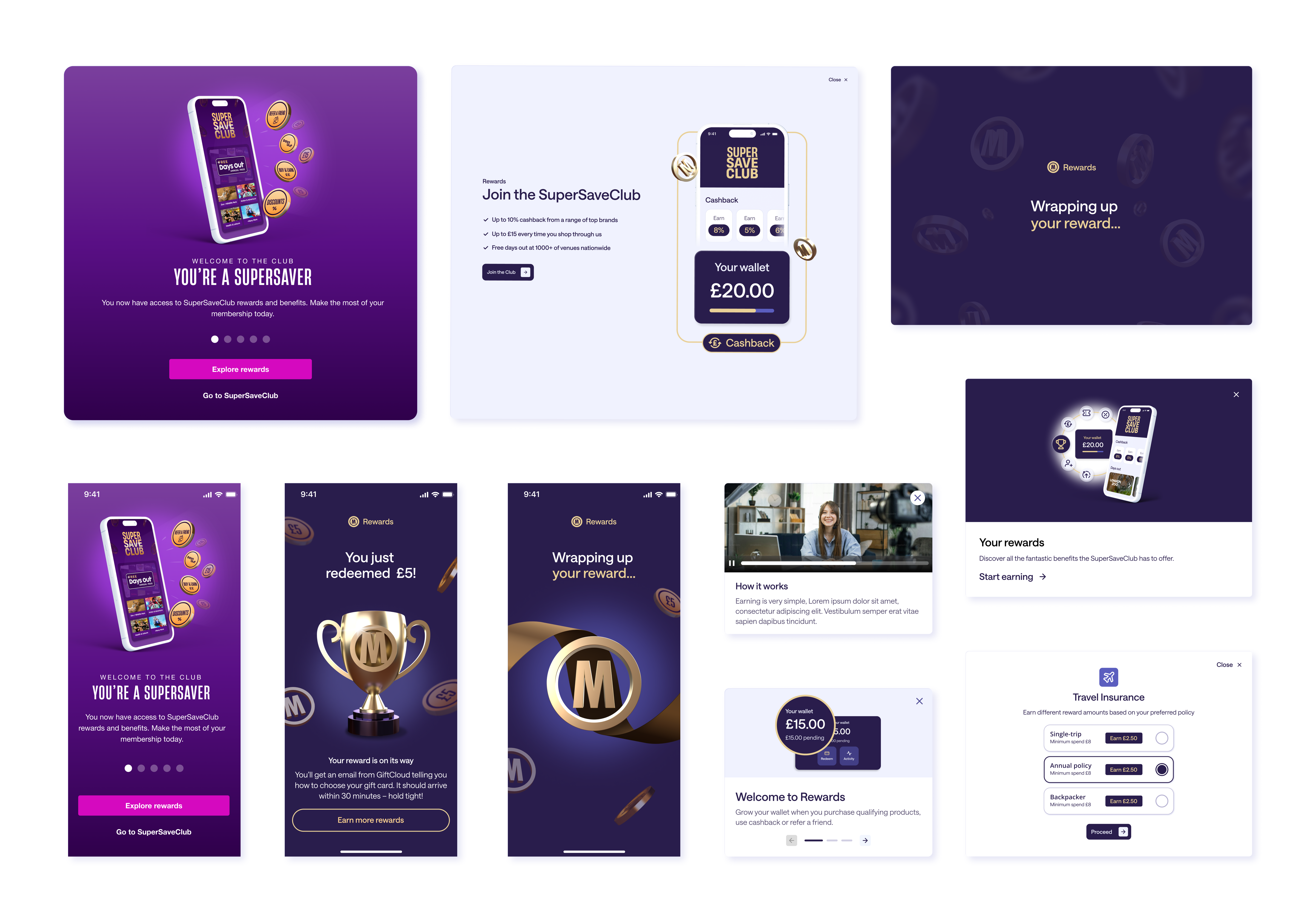
Modals were reduced to 3 variants compared to the 20 different ones flying around and were restricted to specific uses cases.
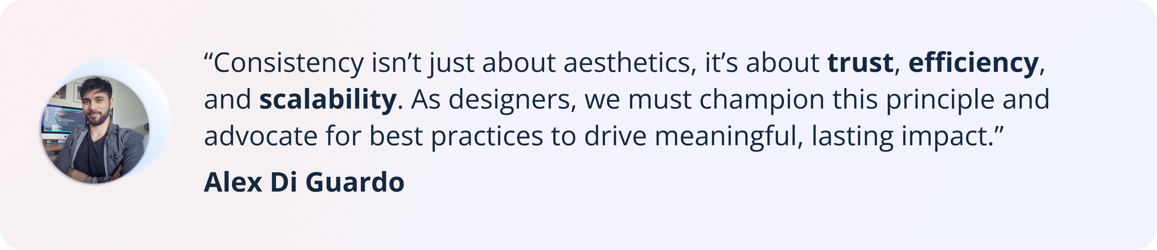
Some participants encountered difficulty dismissing the final modal due to decorative elements being positioned too close to the close button, causing a delay in interaction.

The issue was addressed by replacing the static confetti with a Lottie animation. While the interaction time remained the same, this change eliminated the confusion around dismissing the modal and added a delightful, engaging touch.
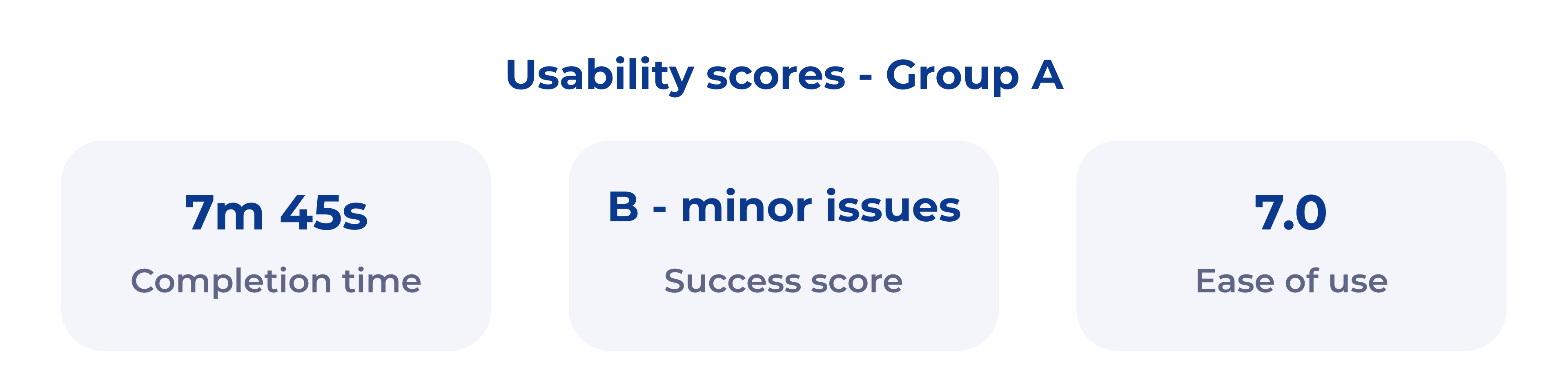
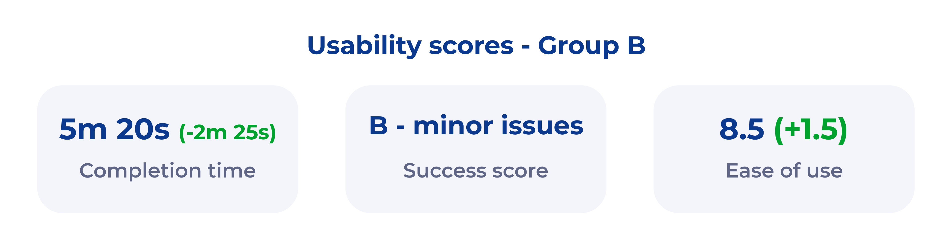
During the A/B test we also noticed an increase of 'club members' thanks to a more streamlined modal-based onboarding process: